
Our Blog
Empowering Your Business Growth Through Technology
Amplify Your Online Presence
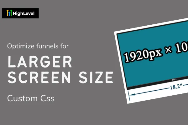
Optimize GoHighLevel Funnels for Large-Scale Displays
Are you wondering why your GoHighLevel website or funnels don't look quite right?
Have you spent countless hours setting up your marketing plan? Building your funnels, creating your automations, and setting up your calendar and automatic emails, just to find that your funnel doesn't look professional?
I have been there, and so have many other digital marketers.
One reason your GoHighLevel site doesn't look quite right could be because the width of your site is not optimized for wide screen displays.

While GoHighLevel is a fantastic tool and something I find to be quite impressive, both new and experienced users have undoubtedly noticed the website and funnel builder could use some enhancements.
One key enhancement I personally make on all my GoHighLevel websites and funnels is:
Setting media queries to accommodate wider screens.
GoHighLevel is great, but I feel like its limitations on setting the default width of the rows to 1170px is a bit of a drawback. Thats why I like to copy this code snippet to all of my HighLevel websites and funnels.
On my personal computer I gain an additional 200px of space on BOTH sides giving it that nice modern and professional look.

I know not all users have wide screens, but just for reference, lets consider how desktop screens have changed.
Let’s consider the evolution of screen resolutions:
In the early 2000s, the most popular screen resolution was 800x600.
By 2003, this shifted to 1024x768.
In 2012, we saw a shift to 1366x768.
By late 2020, the trend moved towards 1920x1080 resolutions.
With GoHighLevel defaulting to a width of 1170px, it's clear that it caters to outdated screen sizes.
Thats cool an all, but "How can we fix this?"
It's easy. like super duper easy. Just copy this code into the custom css tab or a code block element.
TIP: if you are using a code block element, try saving the code block in a Global Section so you can easily access the same code from every page.
Quick code explanation: This code is simply two media queries targeting the wrapper class (.inner) and changing it from the default max-width of 1170px, to a larger size depending on the screen size of the users device.
The first code block adjusts it to 1268px for screens larger than mobile devices (768px) but smaller than wide screens (1200px).
The second block sets a maximum width of 1440px for screen sizes larger than 1200px.
Copy this code into the Custom CSS tab
This code ensures that your site will adjust its size dynamically. No matter the screen size, your websites and funnels will automatically adjust to give your users the best experience.
Plus a wider screen just helps give your site that more modern and professional look.
Why Responsive Design Matters
Now that you have copied the code, you probably dont care about why Responsive Design matters, but I am going to tell you anyway.

Yes it is true that the majority of your users will probably be on mobile devices anyway, but its important to cater your website to all sizes. From the smallest smart phone to the largest screens. A good responsive design enhances your user experience, improves SEO, and ensures accessibility.
Anyway. If you made it down to the bottom of this article then just know that I appreciate you taking the time to spend your time with me. I hope that this code has been beneficial for you and you see some crazy success as you launch your new online adventure with GoHighLevel.
If you like this type of content check out my other blog articles and see what other custom css I like to use to enhance my GoHighLevel sites.
Save time and download one of my templates
As much as I love GoHighLevel, they have always had a pretty bad selection of pre-made templates. Yes they are quick and easy to get started, but they don't look nearly as good as the dozens of websites I have built over at www.ghlwebsitetemplates.com - They are all built with native GHL features and are easy to work with no matter your GoHighLevel skill range.
Enhance Productivity and Efficiency
Discover the possibilities and unlock your business's potential.

