Our Blog
Empowering Your Business Growth Through Technology
Amplify Your Online Presence

GoHighLevel Design Hacks: Custom Gradients for a Modern Look
I was going to start this article with some story about gradients and why you might want to add them blah blah blah... But I am just going to get straight into it. You are obviously here to figure out how to add a gradient to your website.
I have three examples I am going to show you today
Gradient for a website background
Gradient for a website button
Gradient for headings
Feel free to jump to the section you want the code for. The CSS for the background and the button are essentially the same.
The text gradient is a little different, feel free to copy the code, but I also elaborate on how it works if you are interested.
Also, you probably want colors that are not in my example. I have an interactive builder at the bottom of the page you can use to build your own custom gradient and copy the code.
1. Creating a Gradient Background
When used correctly, a custom gradient on your website or sales funnel can look amazing.
It can either make or break your website. Its important to use them sparingly and not draw attention to the gradient itself,
but the content, or special offer you are trying to direct attention to.

Copy this code below into the Custom CSS tab of your GoHighLevel website or funnel.
Then add the class 'gradient-background' to what ever section, row, column, or element you are trying to style.
.gradient-background {
  background: linear-gradient(226deg, #ffb1b1 25%, #cdcbff 75%);
}
Hint: Adding custom classes in GHL can be found in the Advanced Tab of any element.
What this does: This CSS code creates a linear gradient background that subtly changes from a soft pink to a gentle purple.
Gradient Background Example
If you want to modify the colors you can change the HEX code. In the example above that is #FFB1B1 & #CDCBFF.
2. Styling Buttons with Gradient
Gradient buttons are cool right? Yeah kind of sometimes - I don't personally use them all that often. But if you have a good reason to then here is the code to do so.
Gradient Button Example:
A gradient button can be a great way to draw your user to that call to action button. The code for the button is essentially the same as the code for the background. Just make sure you set a different class name if you plan to use gradients for both.
CSS Snippet for Gradient Button:
  .button-gradient {
    background-image: linear-gradient(111deg, #f85d7f, #6b81fa);
  }
What this does: This creates a button with a gradient background. As you can see.
Just to expand your knowledge a little bit on CSS, you can modify the colors in the gradient to span you can just add a number value after each HEX code.
Check out my gradient builder down below. I spent too long building it for this article specifically. You can set the colors, the position, the radius, and even the type.
I explain more about all the gradient options as we continue through this article.
3. Adding a Text Gradient
I think the text gradient is one of my all time favorite CSS tricks. Especially for my sales funnels I use within GoHighLevel.
It is important to use your gradient text properly. Gradient on your text will become overwhelming if you use it for all your paragraph text. Try just using it on a few titles, or call to action areas.
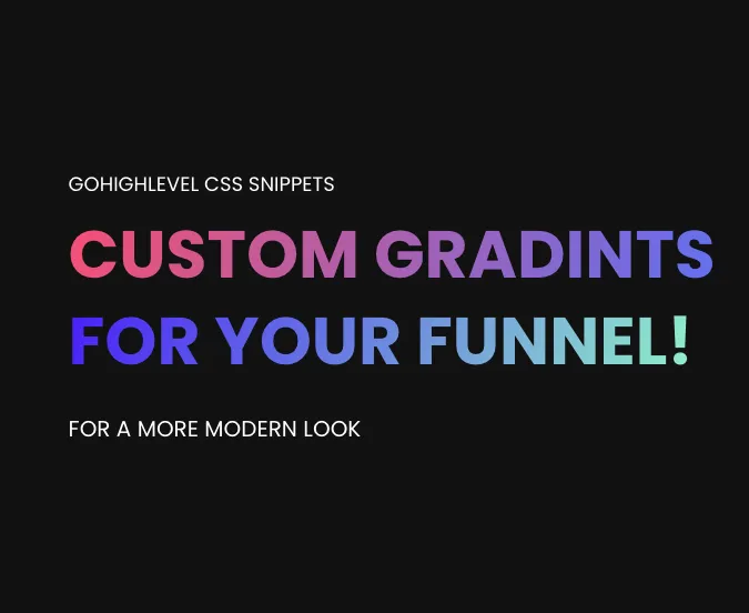
Gradient Text Example:

CSS Snippets for Text Gradient:
.text-gradient-1 {
  background-image: linear-gradient(111deg, #f85d7f, #6b81fa);
  -webkit-background-clip: text;
  background-clip: text;
  -webkit-text-fill-color: transparent;
}
.text-gradient-2 {
background-image: linear-gradient(111deg, #5238ff, #a0fbcd);
-webkit-background-clip: text;
background-clip: text;
-webkit-text-fill-color: transparent;
}What this does: These snippets create text gradients in two different color schemes, giving your headlines a unique and eye-catching appearance.
Notice how this code is different:
Take note of the -webkit-background-clip: text;
and the -webkit-text-fill-color: transparent;
TIP: You can modify 'transparent' to be whatever color you want. Within GoHighLevel funnel builder you will set the color directly in there, and thats why I use transparent for in my sites.
4. Customization and Adaptation
Color Adjustments: Modify the gradient colors to align with your branding. Feel free to experiment with different color combinations.
Gradient Direction: Try different angles and directions for the gradient to see what best suits your design.
Responsive Design: Ensure your gradients look great on all devices, providing a seamless experience for all users.
Interactive Gradient Builder
Pick your colors, position, radius and type. then simple copy the code.
For more creative web design tips, keep exploring our articles, where we delve into various ways to customize and enhance your online presence.
Enhance Productivity and Efficiency
Discover the possibilities and unlock your business's potential.


